

A few years ago, I was facing issues with our email marketing. Most of our emails were landing into spam. Our inbox placement was just 45%. To fix things, I turned to online posts/studies by people who had done it right. Their learnings helped me revive our email marketing and we increased our inbox placement to 97%.
Through this post, I will be walking you through our journey from 45% inbox placement to 97%. I hope people looking for answers on email marketing will benefit from this as I had benefited from what other people had shared. If you like this story, do spread the word 🙂
Please keep in mind, depending on your context your mileage may vary. Here are the sections we will cover:
- The Business Model
- Existing Email Marketing Approach
- Understanding the Problem via Hypothesis Testing
- Setting Benchmarks for the Experiment
- Action Items
- Results
- Some Useful Tools
1. The Business Model:
Ours was a C2B business(Consumer-to-business), where we would purchase used cars from customers and sell them to businesses. Also, the business model was O2O (Online to Offline)- a customer would visit the website to evaluate her car online and then book an appointment for her car’s inspection at one of the retail stores. If she liked the price, she could sell it on the spot and get money into her bank account.
Here is how a typical customer journey looked like:
Evaluation Done >Appointment Booked >Inspection Done >Car Sold >Referral
2. Existing Email Marketing Approach:
Like almost all businesses, we too sent two kinds of emails:
- Transactional emails — sent when a customer expected an email. Example— appointment confirmation email, email with the inspection report, etc.
- Promotional emails — sent to a customer who drops off in the funnel. The aim was to bring her back and increase conversions. These were sent for about a month on Day 0, Day 1, Day 2, Day 3, Day 7, Day 14, Day 21, and Day 30. After that, this customer was put into an inactive bucket that could later be used for database marketing.
A big point to note here is that a customer would typically transact with us once in 3–5 years. So, the email frequency was way less as compared to a business with frequent transactions.
3. Understanding the Problem via Hypothesis Testing:
Our open rates and CTR were clearly poor but the CTOR was okay which meant people who were opening emails were finding it relevant. Here is how our email metrics looked:
- Open Rate: 4.1%
- Click-Through Rate (CTR): 0.3%
- Click to Open Rate (CTOR): 6.4%
If we could increase open rates, other metrics would improve by themselves. So, the problem was — poor open rates.
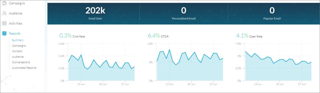
Email Metrics In June
There could be 3 reasons for poor open rates:
- Emails weren’t being delivered
- Subject lines weren’t good enough / relevant
- Emails were delivered but they were going into spam instead of inbox
Testing Hypothesis 1:
To check deliverability, we tested our sender score. A sender score shows your sending reputation on a scale of 1 to 100. Anything below 90 is a low score.
Our sender score was 98%. So, deliverability was clearly not an issue.
Testing Hypothesis 2:
We conducted multiple A/B tests with subject lines and played around with sender IDs as well but the needle didn’t move. Hence, we moved on to our last hypothesis.
Testing Hypothesis 3:
We pulled out a report from Edatasource to know the inbox placement of our emails and this is what we got:
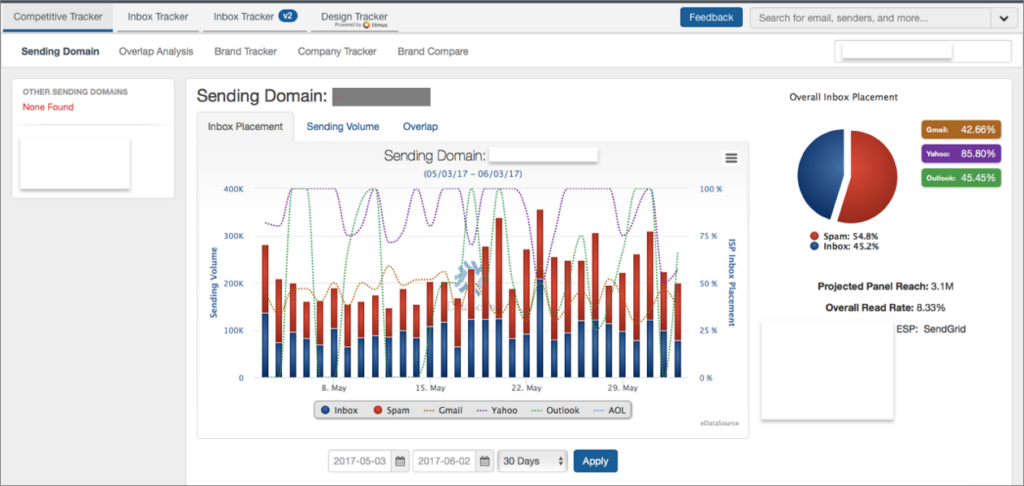
55% of our emails were going into spam. We had to fix this!
4. Setting Benchmarks for the Experiment:
About half of our emails were going to spam. If we increased inbox placement to 100%, we would be able to increase open rates to ~8% and CTR to ~0.6%.
So we set benchmarks as ~95% inbox placement, 8–10% open rates and ~0.6–1% CTR.
5. Action Items:
Now that we knew what the problem was, we quickly made a list of all fixes to be done and divided them into 2 buckets — Technical & Non-Technical.
A. Technical Fixes:
A.1 Updated DNS Records — Our TXT records ( SPF, DKIM, and DMARC) weren’t updated. So, we set up SPF record, DKIM record, and DMARC.
Here is a nice article by Google on understanding DNS basics.
A.2 Separated IPs & Subdomains for transactional and promotional emails — Yes, we didn’t have separate IPs and subdomains for both types of emails. So, we fixed this to ensure that the transactional emails don’t land into spam.
B. Non-Technical Fixes:
B.1 Designed Customer Lifecycle Plan: We analyzed our data to figure out the critical customer touchpoints, the preferred mode of communication at each touchpoint (SMS, Email, IVR, Customer Care Call, Retail Center Call etc), and the frequency of the communication.
Here is how our final plan looked like:
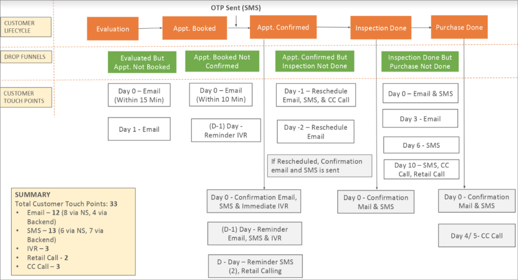
Note — The communication in grey boxes is transactional while the one in white boxes is promotional.
B.2 Revived Communication: Once we had the plan ready, we aligned all our communication as per the stage of the user in the lifecycle.
The communication was consistent across all channels at a particular touch point of the user.
B.3 Redesigned Emails: We made our emails clean, mobile-optimized, and user-friendly. The text to image ratio was kept around 80:20. The size of emails was under 14kb to ensure faster load time on mobile data.
Once done, we tested our emails on Mailtester which is used to check the spam score of email content. The higher the score on a scale of 0 to 10, the better is the content.
Our score increased from 7 to 9
B.4 A/B Tests:
And then we started doing multiple A/B tests. We tested almost every element of email — Subject line, CTA, USP, image, time to send emails, etc.
Results:
Within 2 months, we started seeing improvements in our email metrics. We saw a 7x & 10x increase in our open rate & CTR.
Open Rate: Increased from 4.1% to 28.8%
Click Through Rate (CTR): Increased from 0.3% to 3%
Click to Open Rate (CTOR): Increased from 6.4% to 10.3%
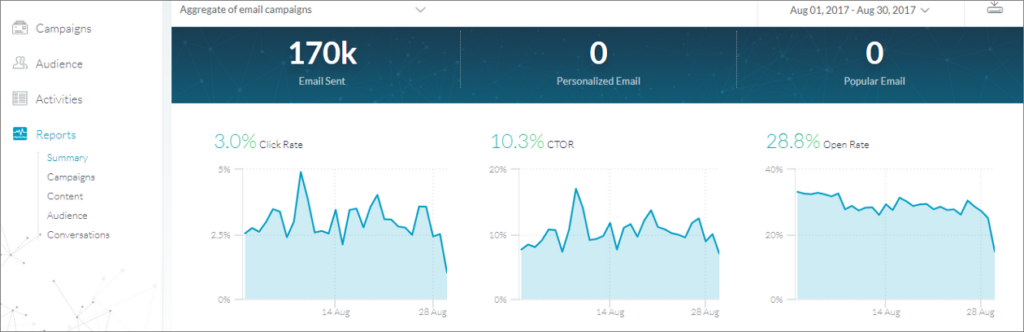
Since all these metrics were more than the benchmark we had set for the experiment, we concluded that the experiment was successful.
Here are some interesting graphs on the dramatic improvement in our domain & IP reputation.
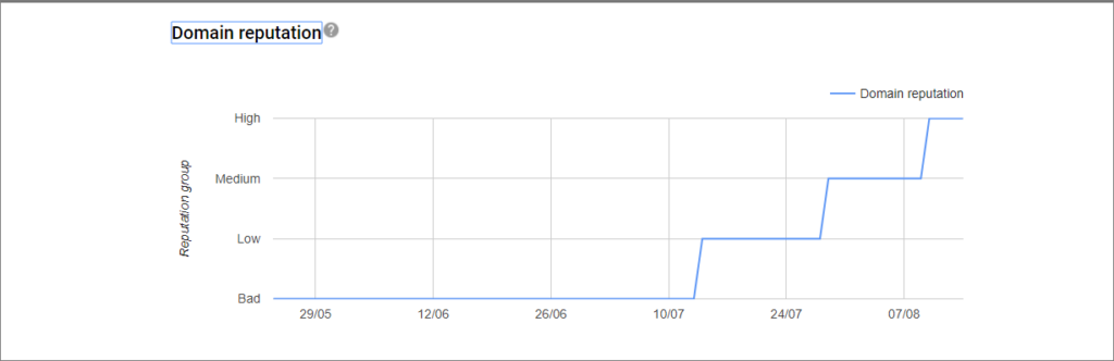
See how the domain reputation increased from “Bad” till June to “High” in August.
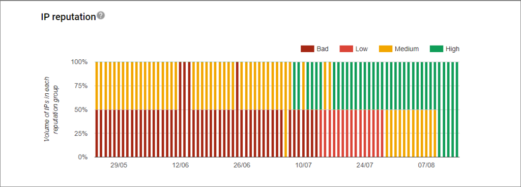
The IP reputation of our 2 IPs also increased from Bad & Medium in June to High in August.
As a result of all this, our inbox placement too increased from 45% to a whopping 97% in just 2 months!
That’s it. We had succeeded in our experiment 🙂
Some Useful Tools:
Last, would like to share links to a few tools that we used during this experiment. Hope you find them useful:
- Google’s Postmaster Tool to know our domain & IP reputation. It is a free tool and also shows delivery errors, spam reports, feedback loop, etc.
- https://www.senderscore.org/ to know your sending reputation on a scale of 1 to 100. Anything below 90 is a low sender score.
- Edatasource to know the inbox placement of your emails. Many people also create a test list, send emails to the list and see where they are landing but in my experience that is directional but not much accurate.
- Mailtester to check the spam score of your email content. This is a free tool. It gives a score from 0 to 10. The lower the score, the more spammy is the content.
That’s all! Thanks for reading this long post. Do share your experiences on email marketing in the comments section. I would love to know what all you tried and what worked for you.
P.S: At 91Ninjas, we help many leading B2B SaaS businesses get their email marketing right.
To schedule a free consultation, drop an email to hello@91ninjas.com.
