
Dreamcast | A brand that feels as smooth as a well-run event
Dreamcast has spent more than a decade running the technology behind large corporate events, expos and exhibitions. Its product had grown into a full event tech suite, but the brand sat in an unclear middle ground between rigid legacy software and newer, slicker builders, and its sub-products did not share one design language. The brief was to make Dreamcast look like a modern platform without losing the human side of events its team cares about.
Industry
Event tech
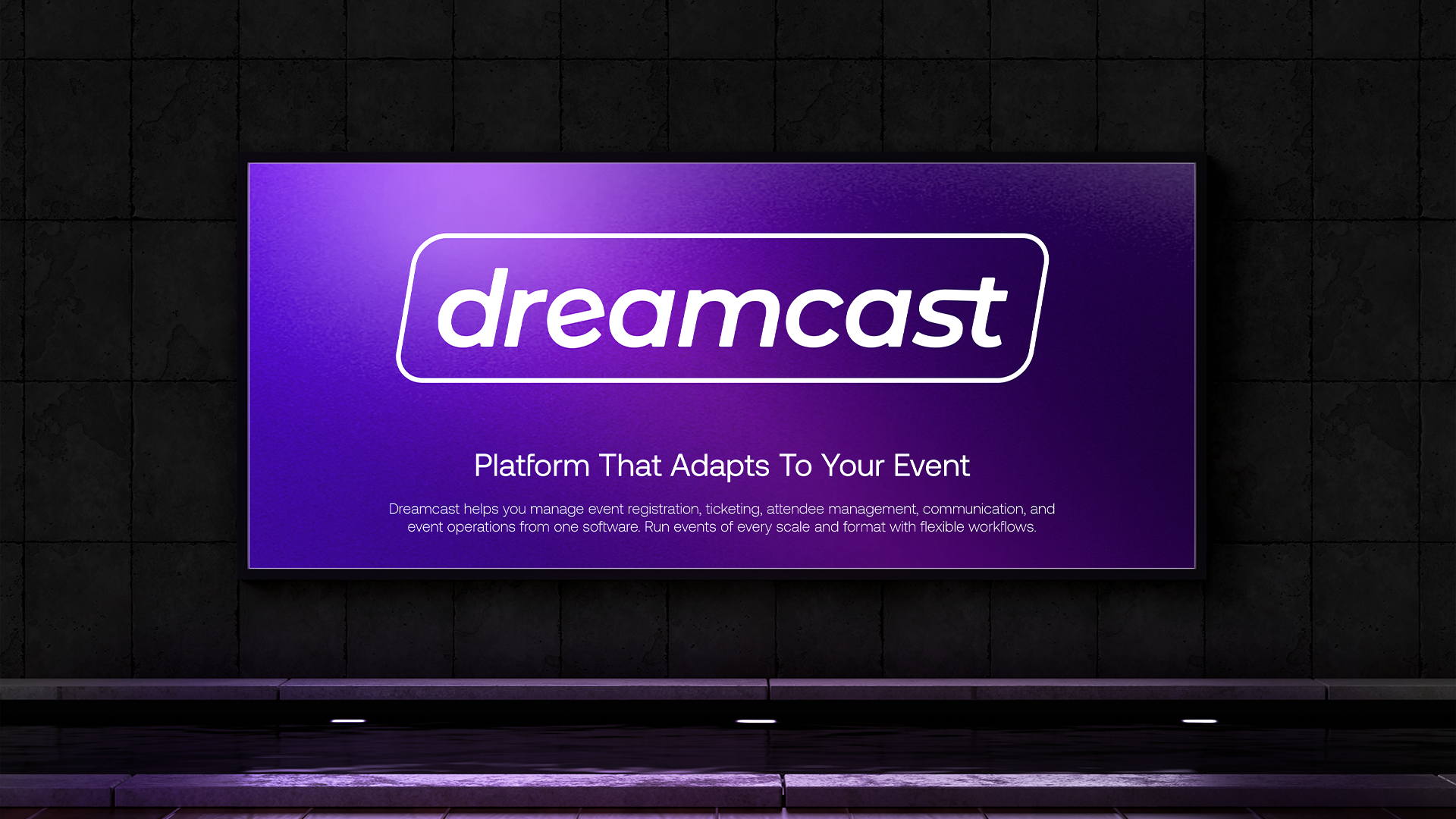
We started with the brand’s character, blending the Magician and Creator archetypes: the part of Dreamcast that makes an event feel effortless, and the part that builds it with precision. That led to a clean, rounded wordmark inside a distinctive outline, a palette of vibrant purples and electric gradients, and fluid geometric forms. Typography balances personality with clarity, so the same system speaks to an event manager, a developer and an executive.
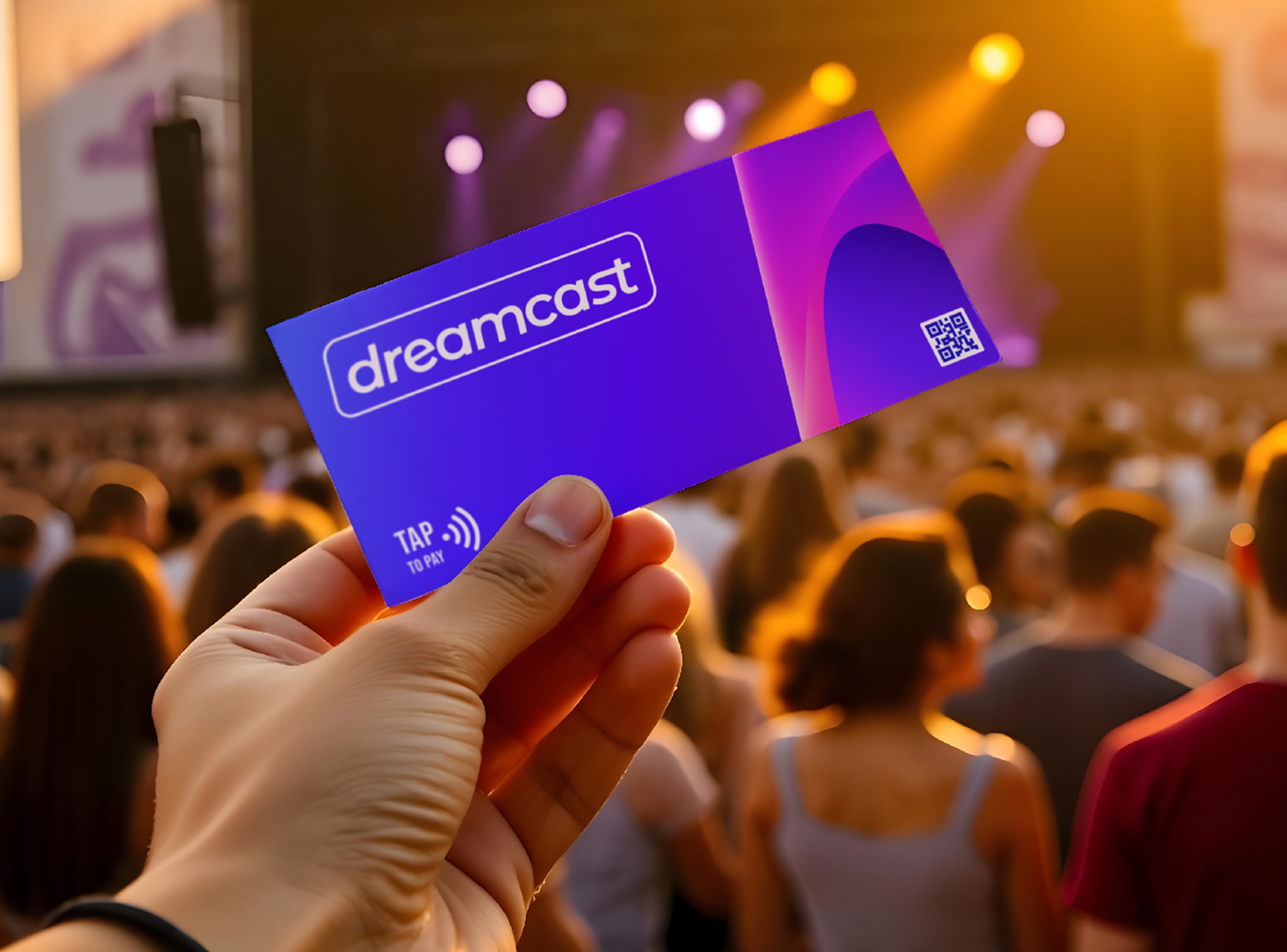
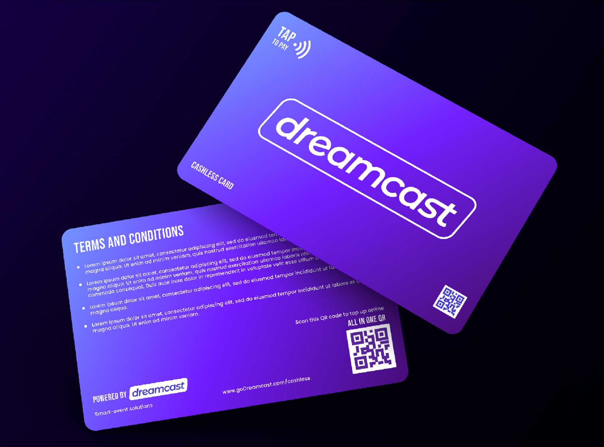
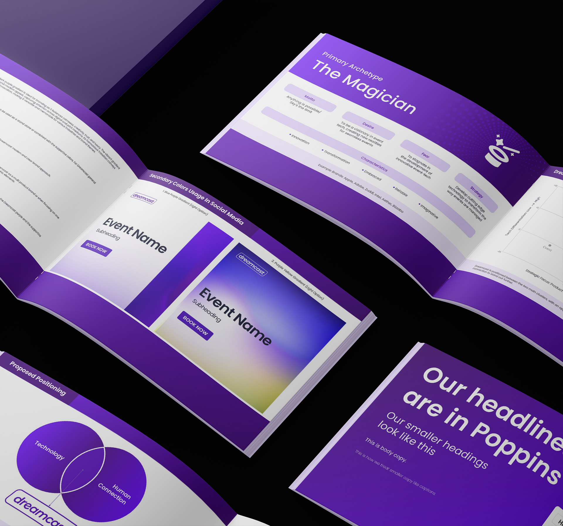
The brand book documents logo usage, colour, typography, iconography, graphic treatments and applications. We then put the system to work on the things attendees actually touch: event signage, lanyards, cashless payment cards and promotional material. One identity now runs across Dreamcast’s sub-products, on screen and on the event floor.
