
Exotel | Turning new brand guidelines into ebooks people finish
Exotel, a cloud communications and CPaaS company, had just refreshed its brand, but its ebooks still read like documents. Topics like VoIP and conversational AI are dense, and readers decide within a few pages whether to keep going. We built an ebook design system that applies the new guidelines to long-form content and makes technical material easier to get through.
Industry
Cloud communications

Bold typography and a clear hierarchy let a reader skim the argument before reading the detail. Gradients from the refreshed palette mark each section, and generous spacing gives technical content room to breathe. Photographs of real people became a key element, because communication is ultimately between people, and the faces bring warmth to a technology story.
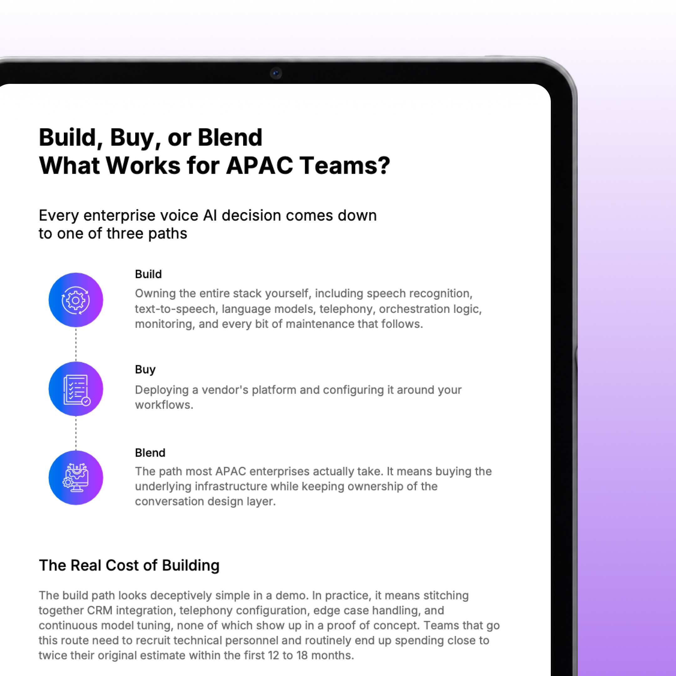
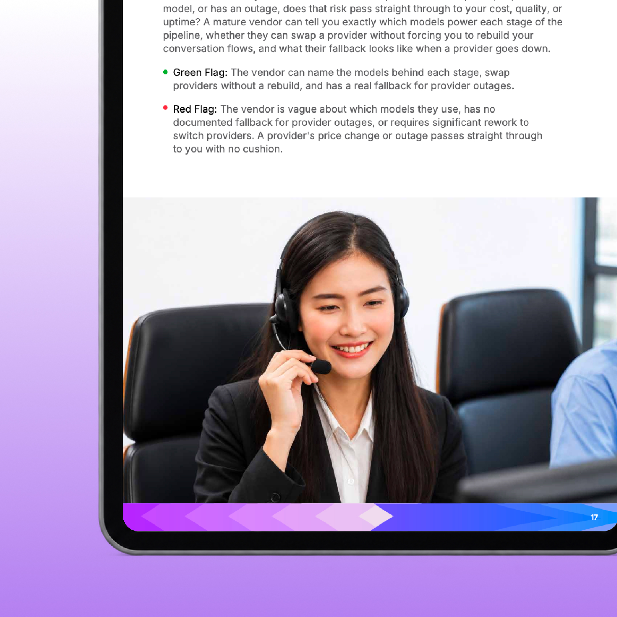
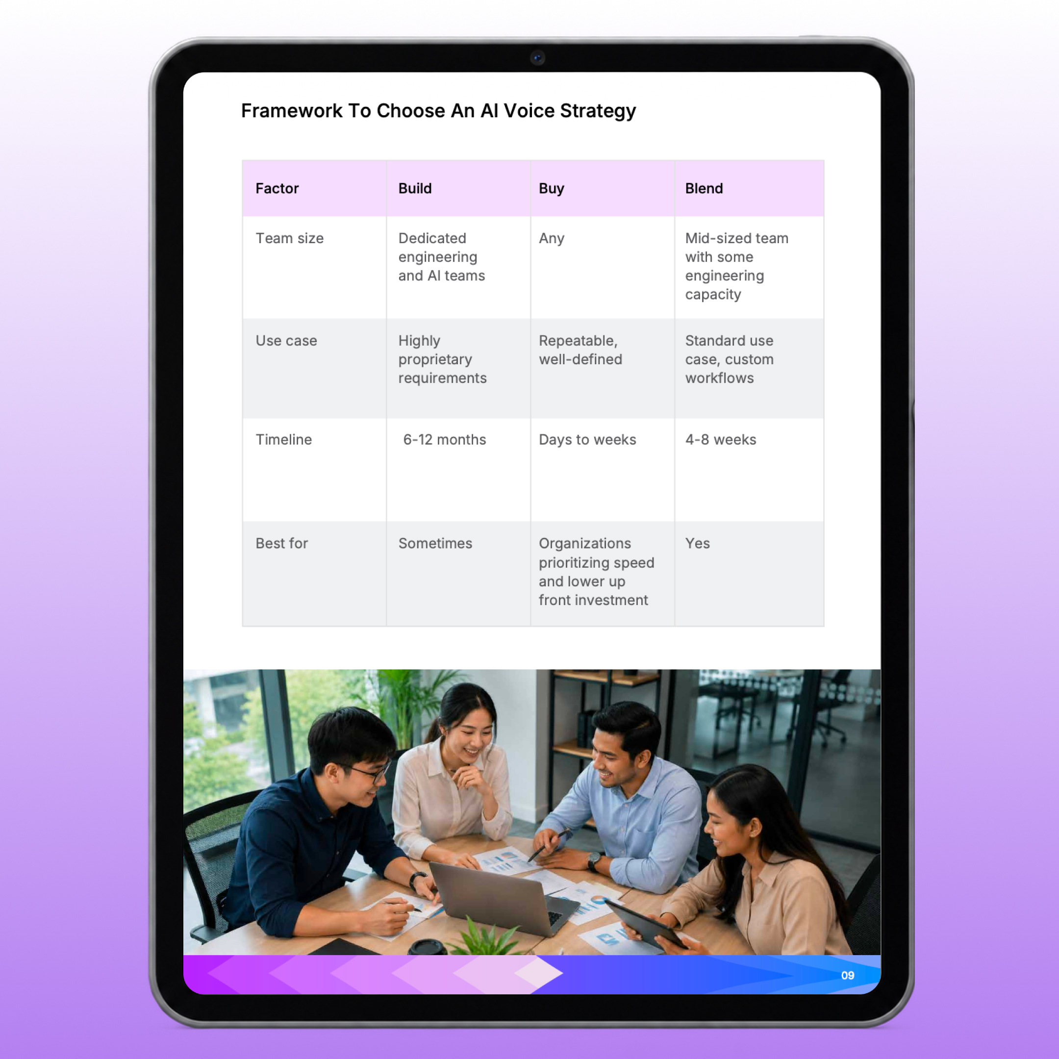
The system includes covers, section openers, data-heavy pages and pull quotes, so every new title can follow the same structure. The result is a set of ebooks that look unmistakably Exotel, read more easily, and feel like parts of one library rather than one-off PDFs.
