
Privado | Getting a privacy brand noticed in a loud feed
Privado’s identity is calm and precise: clean typography, considered layouts and a privacy-first look. That builds trust on a website, but a busy feed rewards whatever is loudest. The brief was to make Privado command attention in ads without losing the composure that makes privacy and legal teams trust it.
Industry
Data privacy
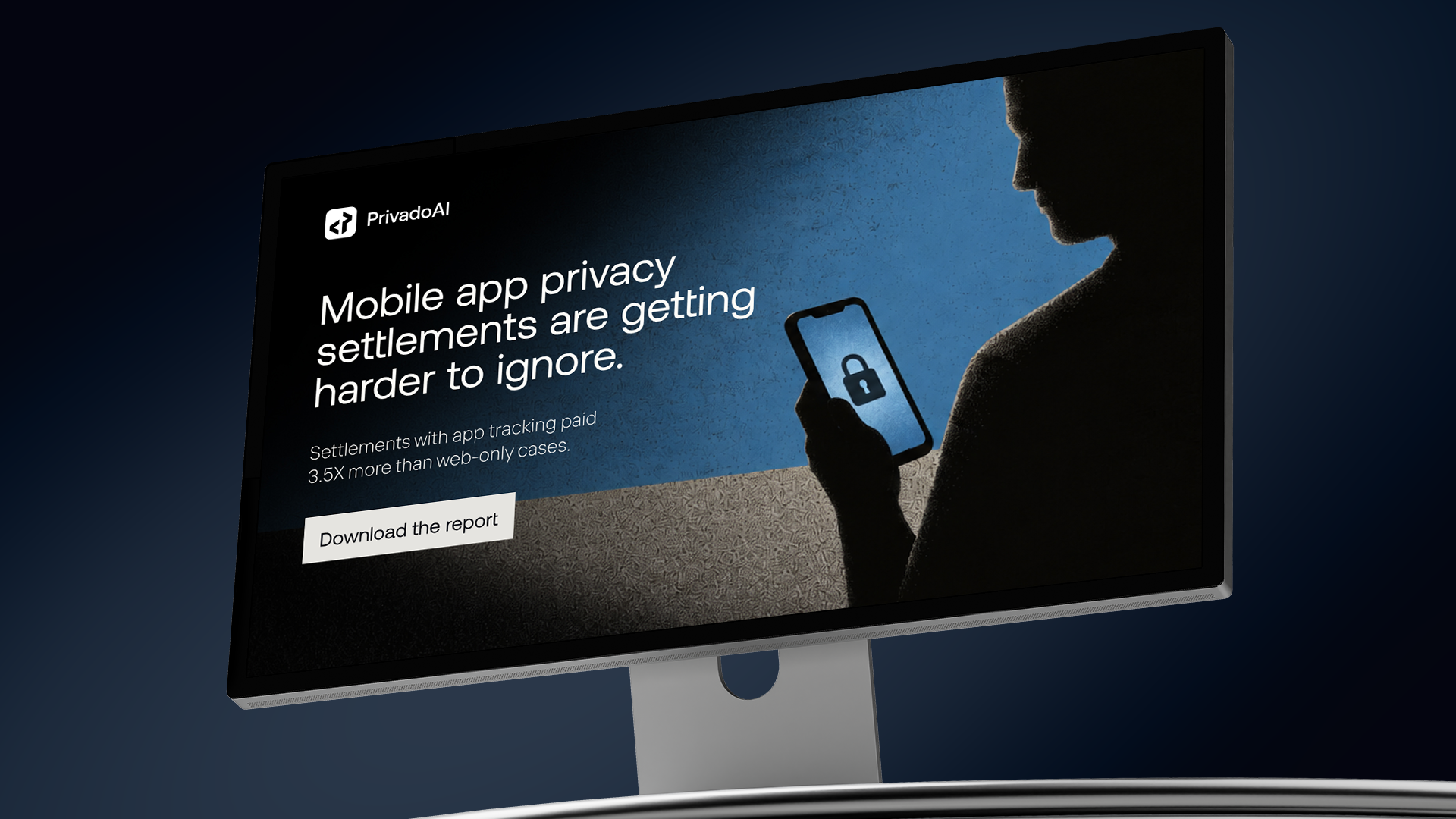
We worked through contrast, composition and imagery. Dark, textured backgrounds create depth, and cinematic photography makes abstract risks feel real: a phone held against a shadowed profile for data tracking, a judge’s gavel for privacy litigation. Each ad is built on one strong visual metaphor, while the brand palette and generous negative space keep the work recognisably Privado.


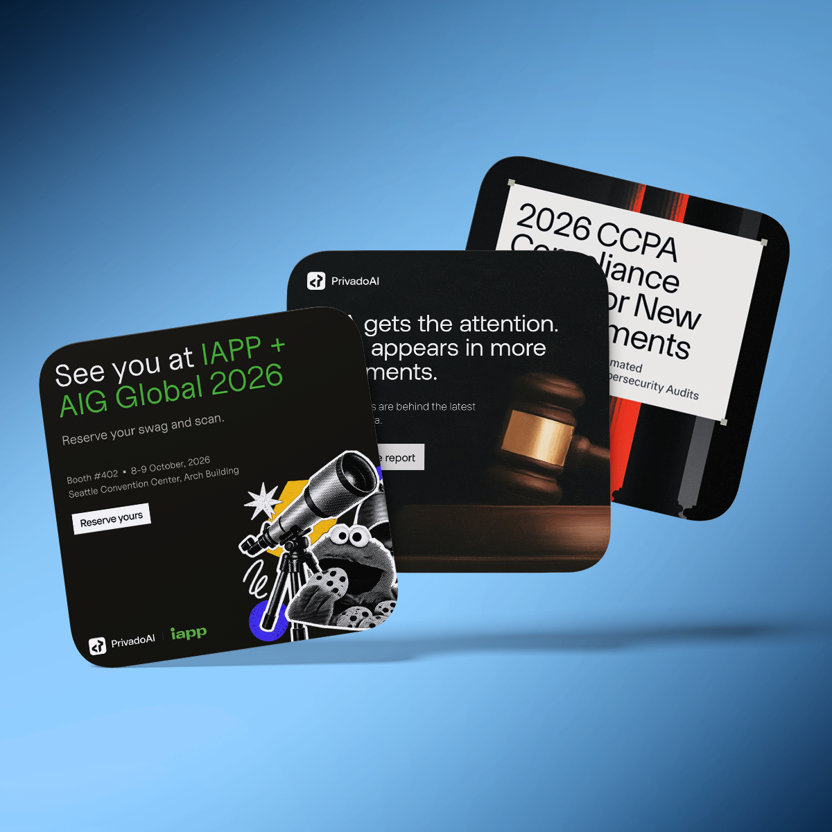
Typography does most of the work. Oversized headlines, controlled line breaks and short supporting copy guide the eye, with consistent logo placement and clear calls to action. The imagery changes from ad to ad, but the structure stays the same, so every creative tells its own story and the full set still reads as one campaign.
