
Veery | A newsletter that changes every edition and still looks like Veery
Most company newsletters repeat one template until readers stop opening them. Veery sells workplace experience, the feeling of an office that simply works, so its newsletter had to feel like an experience too. We treated every edition as its own design brief rather than a slot in a template.
Industry
Commercial real estate
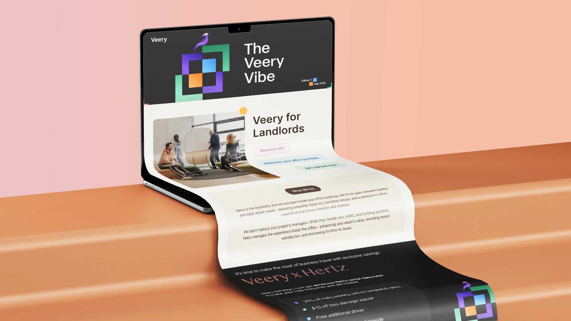
Each message got a visual language to suit it. The referral programme became a polished editorial layout, business partnerships took on a bold, high-contrast look, and service updates used warm photography and soft palettes. Unexpected colour pairings, expressive type and modular layouts gave each edition its own rhythm, and Veery’s geometric bird motif appears in every one.
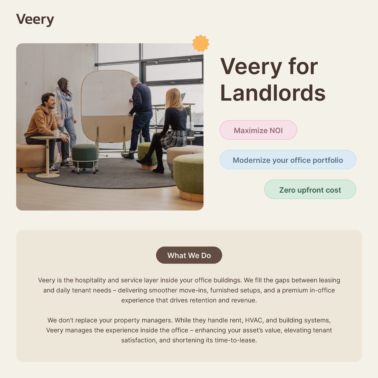
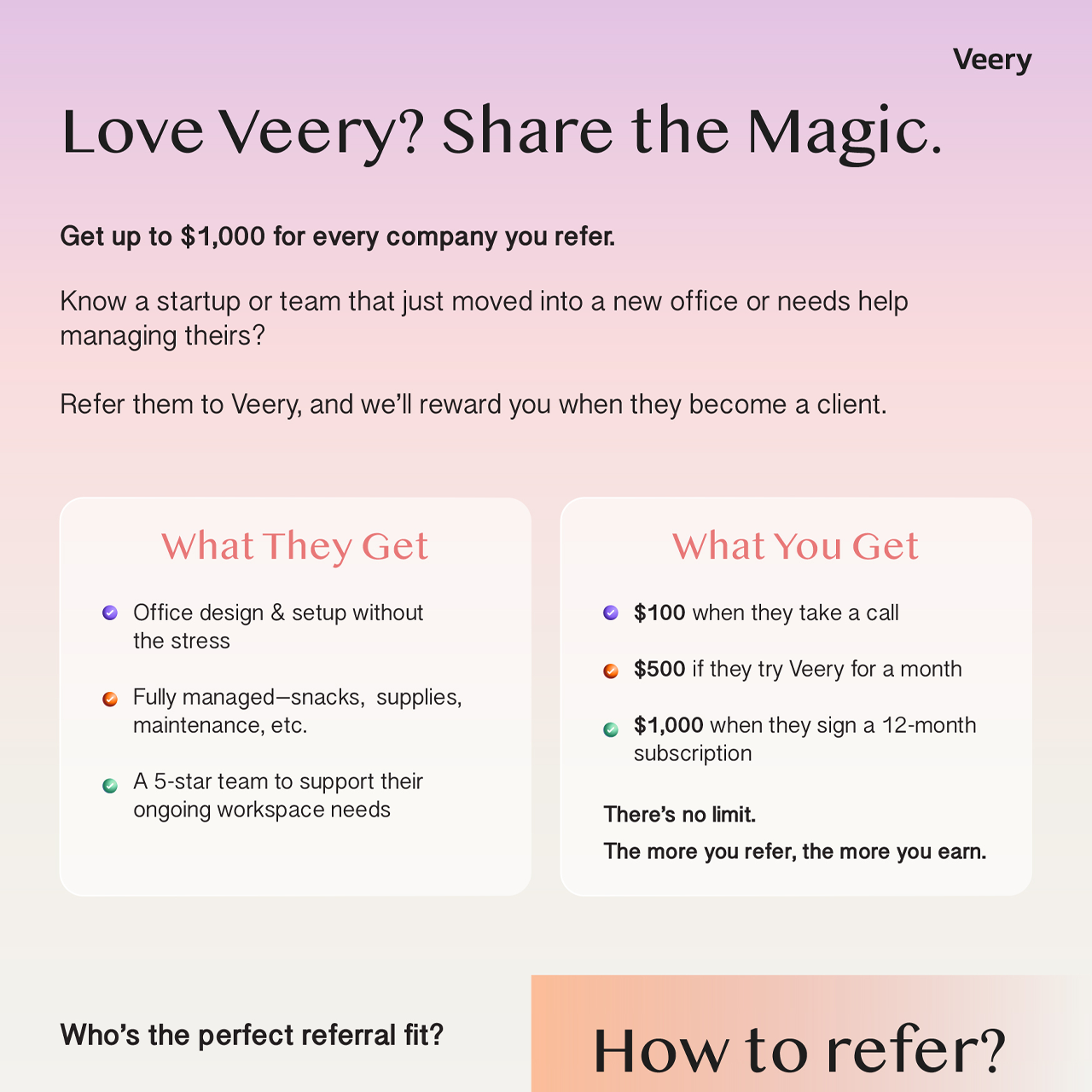
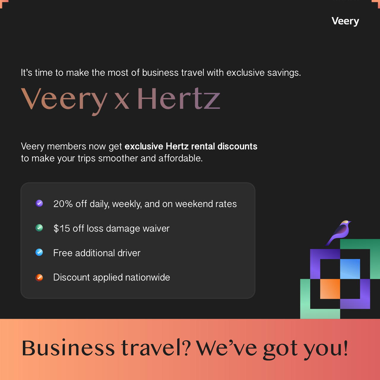
A recurring set of visual cues keeps the series connected while each layout responds to its message, audience and mood. The newsletter reads as an evolving creative series rather than routine business communication, proof that a consistent brand does not need a repetitive one.
